
Hey !! we’re going to create a very simple text effect. A dark, colorful text effect.
You can start by creating an empty file with a black background.
-Make new layer and write something on it (White text). Rasterize and duplicate the layer. Now you have the black background, layer 1 and layer 2 both with your text on them.
-Hide layer 2 and select layer 1:
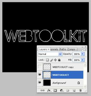
Go Layer -> Layer Style -> Gradient Overlay and create a Gradient like the image below using the Hex Values for colors as the ones below:
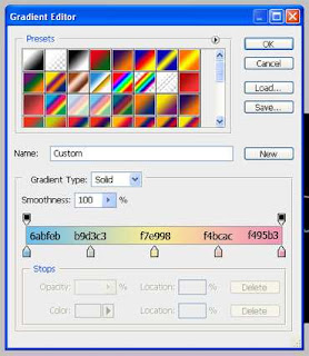
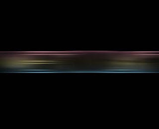
Apply the gradient and stay on the same layer. Now go to Filters -> Blur -> Motion Blur set the Angle to 0 (zero) and the Distance to 50 pixels. Apply the effect and duplicate the layer. You must end up with something like this:
have the following layers:
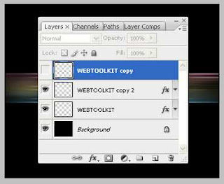
Select the second layer from bottom (the one after the background) and go to Filters -> Distort - Waves and set the following values:
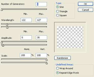
Photoshop Tutorial: Dark But Vivid Text Effect
Note: The dimensions of my PSD is 500px X 300px and the Wave filter with these settings produce the following effect. You may have to experiment a little in order to get the same effect for higher dimensions.
Apply the effect, duplicate the layer and flip the new layer vertically. The result should be something like the image below:
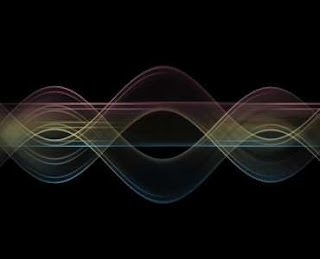
Now, let’s reveal our top layer which is the white rasterized text and set it’s blend mode to Overlay. So, your layers now should be like that:
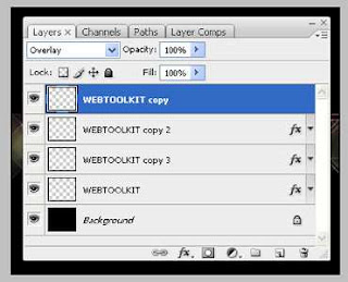
and your PSD should look like:
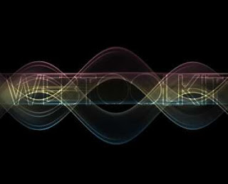
e are getting there. Having the top layer selected go Layer -> New Adjustment Layer -> Hue/Saturation and press ok. Set the Hue value at +34, the Saturation value at +56 and leave the Lighting setting at zero.
Press ok and you should have something like this:
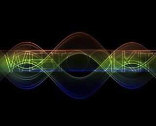
Duplicate our top layer (white text) and set the Blend Mode to Overlay. By setting higher values to the Hue/Saturation adjustment layer we can get the following result.
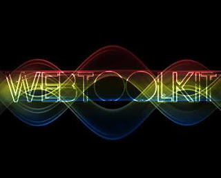
And that’s it. My point in this tutorial is the smooth pastel colors that we used in the beginning which gave us more control of the Hue/Saturation values. It’s much easier for this kind of effects to go from soft colors to vivid ones rather the other way around.


