Saturday, May 29

Using the extract tool

Using the extract tool

The extract tool is a very useful function in Photoshop as it allows you to cleanly select photo's and cut them from backgrounds to paste your image or drawing into another document, or just to get rid of the background. Lets take a look. 


I used this photo


http://www.freedigitalphotos.net/images/view_photog.php?photogid=256

However, try your own photo and see how this works out for you 

Now, open up your image in photoshop. 

Go to Filter > Extract

It will bring up a box like this once you have selected extract.
At the side panel on the left hand side there are icons in which you need to select in order to use the extract tool.


If you hover over the top one eventually it will say 'Edge highlighter'. Select this tool.

*Hover over the other icons and find out what they are. The two tools we are using to day are the:
- Edge Highlighter (B)
- Fill tool. (G)

I will also be using the Hand (H) and Zoom tool (Z)

Now, to start to extract your photo from the background I find it is easiest to Zoom in on the image this way you are able to get the closest possible selection which makes the out come a lot nicer. 

Before we go on I want to bring to your attention a handy little setting on here called the 'Smart Highlighting' tool. You can find it on the right hand side tool pane. 

This tools help you accurately select your image around the outline of what you want to select. When you have this selected you get more accurate results so I recommend you use this, If not, then use the normal edge highlighter 

Carefully start to trace around the edge of what you want to keep. 
 
 
When you have gone around fully what you want to keep, select the 'Fill tool' (G) and then fill in the area you want to keep. 

*Common Problem
 
When this happens, it means you have not joined up your edges properly. When this happens go back and search for a gap in your outline. When this has been fixed, try again. 
 
 
Click ok, then you should have the image you want to keep on your canvas. 


Thanks for taking your time to view this and I hoped it helped to understand the extract tool more as I know at first I didn't exactly know what the exact tool was about until I actually fiddled with it a bit!


Wednesday, May 26

Super Easy Typographic Portrait in Photoshop

"Super Easy TypographicPortrait in Photoshop"

In this tutorial I will show you how to create a really cool and super easy typographic portrait in Photoshop. We will use the Displace filter and some Blend Modes to achieve the effect. The whole process is quite simple but it might take you some time to add the texts and elements, but once you do that the rest is very straight forward. 


 Step 1

Open Photoshop and create a new document. I used 2560x1440 pixels for the size. Then import a photo of yours, I'm using a portrait taken by a John Arlington, a great photographer friend of mine. The photo I have is with white background, so extract the background.


 Step 2

Duplicate the layer and go to Image>Adjustment>Desaturate. You will have a black and white photo. Add a white background. After that save the file, it has to be PSD otherwise it won't work with the Displace filter.


 Step 3

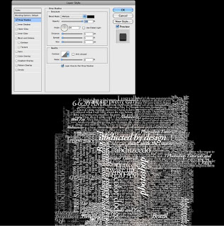
With the Horizontal Type Tool (T) create text boxes and start adding texts. The idea is to play with the texts, they don't have to be readable, or at least with normal legibility, so play with the line-heights, reduce that so the lines overlay one another.
Also make some keywords much bigger and bold, like in my case I highlight some words like Photoshop Tutorials, Illustrator, Inspiration... Also, play with italic, regular texts as well as alignments and text sizes.  

Tip: I used Garamond for the font, I think serif fonts look much better for this effect.


Step 4


For each layer, go to Layer>Layer Style>Drop Shadow. Use Multiply for the Blend Mode, black for the color, 90º for the Angle and 5 pixels for Distance, Spread and Size.
Also, group all the layers and the duplicate the group. Go to Layer>Merge Group and then go to Filter>Blur>Gaussian Blur. Use 10 pixels for the Radius. This blurry layer will have to stay behind the regular one. The idea is to add some depth to your text, that's why the shadow.
You can duplicate the orginal text again and move it a little bit to the top and left as well to add even more depth.


Step 5


Select all the text layers and merge them into one layer only, then go to Filter>Distort>Displace
A dialog box will appear asking you to choose a file. Select the PSD file we created on the Step 2. After that for the Displace settings use 15 for the Horizontal and Vertical Scale; use Tile for Displacement Map and Repeat Edge Pixels for the Undefined Areas.
The displacement map will distort the layer based on the greyscale photo we used, the dark tones go down while the lights go up.


Step 6


Put the photo layer on top of the white text layer, then change the Blend Mode of the photo layer to Light Burn.


Step 7


The photo has too many details, so go to Filter>Noise>Dust & Scratches. Use 7 pixels for the Radius and 0 levels for the Threshold.


Step 8


Mask the text layer so you will have just the texts over the photo.


 Conclusion
You can reduce a little bit the saturation and as I mentioned before, you can add more text layers and even try different symbols and shapes.
There are many ways to create this effect, this perhaps is the easiest one, but you have to be very careful to make everything very subtle, otherwise the effect won't look as cool as we expect.


Tuesday, May 25

Poster Girl Photoshop Tutorial


Poster Girlphotoshop tutorial

Create an image with a black background. Try to make it a reasonable size so that your stock image can fit in the centre with plenty of area left to work with. Its easier to crop off excess later than to add to it.


We must start by removing the background. Copy and paste in your stock image and select the Pen Tool (P). Draw a path around your object using a series of clicks. I tend to spend a lot of time doing this, zoom right in and get right into all the curves. The more clicks you have the smoother your image will appear.
All of the images can be clicked to enlarge.

Once you have created a path around the entire subject select the ‘Load Path As a Selection’ button from the bottom of the Paths tab. Highlighted in the following image with the large red arrow. If you cannot see this button choose 
Window  --> Paths from the tool bar at the top.

Now your subject is highlighted choose Select   --> Refine Edge from the tool bar and tamper with the settings until you get the desired look. Try not to use too much smoothing and feathering as you lose the sharpness in the image.

Once you have the desired effect click OK and hit delete to remove your background.
The next step is to sharpen up our source image a bit. We do this using a high pass filter and you can see a slightly more detailed tutorial of what we are doing here. Simply duplicate your layer by dragging it onto the new layer symbol in the layers tab (or right click and choose duplicate layer).

Now on the new layer choose Filter - -->Other -->Pass from the tool bar. Set the amount to 5px and click OK.


Now don’t worry when the whole thing goes a big gray mess. Simply choose Layer  --> Layer Style  --> Blending Options and change the Blending Mode from Normal to Overlay.


This will make our image appear a higher resolution than it actually is.
The next step is to start creating some light behind our subject. Create a new layer above the background layer but under the girl. Select the gradient tool and choose one that is reasonably subtle. I chose ‘Copper’ and changed the white highlight to a darker brown.

Now draw a diagonal line from one side of your image to the other to create your gradient.

Now we must create a layer mask to hide this gradient. So choose Layer > Layer Mask > Hide All from the toolbar.After it has been hidden, choose the Lasso Tool (L) and draw a sort of splodge around the girl.

Choose Select  --> Modify  --> Feather from the toolbar. This decides how much the sides fade. I set mine to 250 as my image is such a large resolution, but if you are using a smaller image you would obviously make it less. Its just a case of playing around until you get the desired effect. Once you have done the Feather hit delete and you should have a bit of a lighting effect behind your girl.

Now our girl seems a bit too bright, so lets desaturate the image a bit. Choose the base layer for your girl (not the one with the high pass filter) and choose Image  --> Adjustments  --> Hue and Saturation. Tick the Colorize box and move the sliders to make the girl almost black and white but with a bit of a sepia tint.
Now go back to the ’splodge’ layer we created before and duplicate it the same way you did with the girl. ChooseFilter  --> Pixelate  --> Mezzotint and select Long Lines from the drop down menu. Now it will look a bit weird, but choose Layer  -->Layer Style- --> Blending options and change the opacity to about 15%.

Now create a new layer. Choose the Brush Tool (B), right click and choose a large soft brush. Select some vibrant colours, (I used Pink and Yellow) and simply make a couple of clicks around the edge of the girl using various sized brushes.


After this again change the opacity. Set it to about 40% so that it is a lot more subtle.
Then create a new layer again, above the pink and yellow and choose white. White will make our colours appear even more vibrant. Select a slightly smaller brush and put in some white. Play with the opacity again, mine is about 64%.
Create another new layer above the girl this time. Choose the soft brush again and draw a couple of coloured circles. I put one either side of her as this will make it look like the light is bursting past her.


Now choose Layer  --> Layer Style  --> Blending Options and change the Blend Mode toColor Dodge’. This will make the two circles of colour appear much more intense.


Create another new layer just above the background. Using the Elliptical Marquee Tool (M) draw some large and small circles around the area. Fill them with a bright green.
Change the Opacity to about 7-10%.
Repeat this for two more layers and just mess with the opacities. But use different colours. I used yellow and pink to go with my green.


Now create a new layer above our Mezzotint layer but below the coloured circles. Choose the Channels Tab (Window > Channels) do a CMD-Click (CTRL-Click) on the layer labeled green. You will notice some of your image will highlight.


Now go back to your layers tab, press (D) to reset your colour pallet, and press CMD+Backspace (CTRL+Backspace) to fill the area with white. Next choose Filter > Blur > Radial Blur from the tool bar. Set  the Amount to 100, the Blur Method to Zoom and the Quality to Best and click OK.


Now lets make some lightning.  Create a new layer just above the background. Select the Gradient Tool again but this time choose a Radial Gradient. Choose the standard Black and White gradient, not the copper one we used earlier. Press (D) to make sure your colours are defaulted. Draw a reasonable size circular gradient somewhere around your subject.


After this go to Filter  --> Render  -->Difference Clouds. Then press CMD+I (CTRL+I) to invert the image.


Next choose Image  -->Adjustments  --> Levels and change the black output level to around 180 until you get the desired lightning effect. 

After you have your lightning simply choose the Eraser Tool and delete the mess in the surrounding area so you are left with just the circular bolt. Choose Image  -->Adjustments  --> Hue and Saturation from the tool bar, and like earlier tick the Colorize box. Change the hue and saturation until you get your electricity the desired colour.
I again went for a bright pink. Select Layer  --> Layer Style  --> Blending Options and set the Blend Mode to Screen. This way the black background is gone and you can put your electricity wherever you want it.
Repeat the step two or three times and position them around your subject.


For the next section we must create a new Brush to work with. Select  Window  --> Brushes from the tool bar. and change your settings to these.


Create a new layer above the girl, and using this brush, mess about with the size and draw in some random flicks of colour. Use the Eraser and delete anything that obstructs her face etc. Select Filter  --> Blur  --> Gausian Blur and set the radius to 1px.


Create another new layer just above the green circles etc we made earlier. Repeat the previous step but use much smaller brushes and draw in way more dots. Use a variety of colours and try to make them appear as if they are dispersing the further away from the light they get.

Go to Layer  -->Layer Style  --> Blending Options. Select Outer Glow.
Duplicate the layer, change the opacity to about 12% and reposition it slightly.
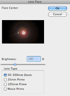
Select your Background layer and choose Filter  --> Render  --> Lense Flare. Position this roughly where your light source appears to come from and click ok.


Now its just a case of adding your own touch to it. Your name, website. Anything. Choose a funky font from www.acidfonts.com and stick it somewhere in your image. And your done!


Saturday, May 22

Making of the Imaginary Paint Dancers

Making of the Imaginary Paint Dancers


Create a document of size 595×842 pixels with black background. Create a new layer and name it as "Grey Spot". Using a Brush tool, Soft Rounded 600px and color #333333, paint a huge grey dot at the center of the document.

 Using the same method above, paint a few more spots with your preferred colors like the example below.

 Download a cool texture from KrakoGraff. Place the texture above all the color spots you done earlier. Go to Image > Adjustments >gt; Desaturate. Set the Blend Mode of this layer to Overlay.


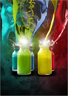
Crop out the bottles and place it in the middle as shown below.


Make a new layer below the bottles and name it as "Shadows". Paint the bottles’ shadows with the Brush tool.

This is a fantasic set of stocks that you gonna love it.
Choose one of the paint image like the one I got below. Select a small white area in the image.
Go to Select > Similar to select all the other white areas.
Press Delete to remove the white background.


Go to Image > Adjustments > Hue/Saturation. Check on Colorize and change the paint splash to red color. Right-click on the layer and choose Blending Options. Select Inner Glow and input the following settings.

 Make a few more paint splashes to the top of each paint bottle using the method above.


Download Zentai image from Mjranum Stock. There is a series of these images that we have to thank Marcus for sharing with us. Crop the figure out from the background.

Go to Image > Adjustments > Hue/Saturation. Check on Colorize and change the figure to blue color.

 Go to Filter > Artistic > Plastic Wrap. Apply the following settings to the image.

 Resize the dancing figure to fit in the blue paint splash. Using the Eraser tool, fade the bottom of the figure like the example below.


Repeat the steps for a few more dancing figures that you can find from the Mjranum’s deviantART gallery.


Create a new layer and name it as "Glows". Using the Brush tool, Soft Rounded 50px and white color, paint a small dot at the lid of one paint bottle.
 
Repeat the same for the lids of all paint bottles.


Paint a few small splatter at the glowing spots with white color.


Create a new layer behind the paint bottles and name it as "Smoke". Paint a few white smoke with the brushes you downloaded. Set the Opacity of this layer to 40%. 

Create a new layer behind the "Smoke" layer and name it as "Scribbles". Using the Brush tool, Soft Rounded 2px and white color, scribble some stuffs randomly around the document area.


 Resize it smaller and place it just behind the dancing figures. Right-click on this layer and choose Blending Options. Select Outer Glow and apply the following settings.


 Duplicate a few of the "Scribble" layers, make them smaller and position randomly around the dancing figures.


Create a new layer and name it as "Glowing Lines". Using the Pen tool, draw a curve as shown below. Right-click on the path and choose Stroke Path. Check on Simulate Pressure and hit OK. Right-click on the layer and choose Blending Options. Choose Outer Glow and leave the settings as default.

  
Make a Photo Filter Adjustment Layer at the top of all layers. Choose Cooling Filter (82) and density to be 25%.

Make a Levels Adjustment Layer and set the settings as 0, 0.70, 255.


 And there you are! The work is done! 
 Hope you enjoyed the tutorial and wish everyone have a great weekend.