Sunday, January 23

Dark Grunge Photo Effect


Dark 
Grunge Photo Effect

  In this Photoshop tutorial you will learn a neat grungy photo effect using a variety of Photoshop filters and image adjustments.  

Step 1

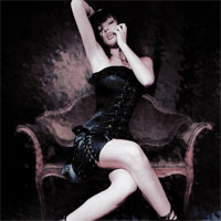
Lets start by taking a look at the photo I’ve chosen for today’s tutorial. 
This is a great shot by the photographer Tinebra from Italy. I was looking for something sort of dark, sexy and mildly gothic to begin with for this particular effect because the genre seems to suit the effect well. Not to say that you couldn’t apply this effect to a photo of your two year old niece frolicking in a garden of tulips


Step 2

Lets begin by duplicating our Background layer by pressing Command-J (PC: Ctrl-J), not only to preserve the original image incase we need to come back to it, but because we’re about to apply 4 quite destructive filters to the image and we’ll need to have a copy of the original underneath for masking purposes later. I’m going to call this layer Grunge.


Step 3

The first thing I want to do is really stir up the lines in the photo and to do this we’ll be using the Ripple filter. Choose Filter>Distort>Ripple from the main menu and set the Amount to 999% and leave the size at Medium.
For the sake of scrolling and download speed I’ll only be showing you a portion of the image as we go through these steps.


Step 4

Second we’ll use the Diffuse filter to rough up the edges of our ripples by choosing Filter>Stylize>Diffuse from the main menu. Leave the mode set to the default which is Normal and click OK.


 Step 5

Third lets soften the effect of the Diffuse filter with a slight blur by choosing Filter>Blur>Gaussian Blur from the main menu and using a radius of 0.5 pixels.


Step 6

And the last thing we’re going to do here is randomize the mess just a little more using the Splatter filter by choosing Filter>Brush Strokes>Splatter from the main menu and then using the settings 9 and 4.


Step 7

For the sake of reference, here’s what my image looks like so far.


Step 8

Obviously we don’t want the entire image to look like this, so lets click the Add Layer Mask icon at the bottom of the Layers palette (its the one that looks like a circle inside a rectangle).


Step 9

- Press the B key to call the Brush tool, select a round soft edged brush from the Brush Picker and make sure that the Opacity of the brush is set to 100%.
- Press the D key to reset your foreground color to black and then making sure the layer mask is selected in the layers palette (it will have little brackets around it), paint onto the layer mask with black where you want the underlying Background layer to show through.
- In my photo I’m only going to paint over the woman, exposing her clearly and perhaps leaving a little grunge around her edges.
(*note: by using the bracket keys [ and ], you can increase or decrease the size of your brush)


Step 10

After using the brush at 100% opacity for the main features, I dropped the opacity of the brush to around 30% and painted around her rough edges as well as a little on the bench she’s sitting on, just to soften things up and let a little more detail through. If you Option-Click (PC: Alt-Click) on the Layer Mask in the Layers palette, you can see exactly what your mask looks like. I’ve inlayed my mask on the image so you can see it.


Step 11

Create a new layer by clicking the Create New Layer icon at the bottom of the Layers palette and call it Gradient Map. From the main menu choose Image>Apply Image and click OK without changing any of the default settings.
- What the Apply Image function has just done is placed a merged composite of all our layers into a new layer.


Step 12

We’ll now add the Gradient Map filter to this layer by choosing Image>Adjustments>Gradient Map. When the dialog appears, choose the Black to White gradient from the Gradient Picker and click OK.


Step 13

Now lets change the way this layer relates to the layers below by changing the layer’s Blend Mode to either Lighten or Darken. Each will give a different effect so try them both to decide which works best for you. I chose Lighten


Step 14

Create a new layer called Channel Mixer and just like we did in Step 11 choose Image>Apply Image and click OK, creating a new merged snapshot of our project on a new layer.


Step 15

It’s time to apply our last set of adjustments. We will be using the Selective Color adjustment so choose Image>Adjustments>Selective Color from the main menu. From the Colors drop-down menu at the top of the Selective Color dialog box choose the following colors and change the settings accordingly and click OK when you’re done.
Color (Whites) +14, -10, 0, 0 Relative
Color (Neutrals) -5, +3, -4, -20 Relative
Color (Blacks) +41, +15, 0, +9 Relative


Step 16

And that’s it, you’re all done! Here’s the before and after comparison.


Step 17

And my final image is shown below. This result also looks incredible combined with a cool edge effect like last weeks Photo Transfer Edge Effect tutorial.
(*note: Because of the Copyright limitations of this image and the fact that our filters were applied directly to the image itself, no download is available for this tutorial.)


.

Wednesday, January 12

Wood Inlay Text

Wood Inlay Text


Step 1

Lets start by setting up a new document, 540×300 pixels at 72ppi but for this tutorial size doesn’t matter at all. There are plenty of good places online to find nice wood textures and I found a great one HERE.
We’re going to start by creating 3 layers and pasting wood textures in each. Color isn’t as important as the tone of the wood and for this lesson I chose a very light, medium and dark piece to work with.
I arranged them from lightest on the bottom to darkest on the top because I want the light wood to comprise the image’s background.
Go ahead and find a few wood swatches and put each on it’s own layer. The textures at defcon-x are very high resolution and you may want to use the Free Transform function to bring them down to the proper size for your project.

Step 2

Next we need to select a font to work with. For this effect I prefer a blocky sort of disco style font because the abstract nature of the letters. The font I’m going to use here is called Bifurk and is available for free at DAFONT
With the top layer of wood texture selected, press the T key to invoke the Type tool and click and type on the stage to add your text.


Step 3

Now lets add a few layer masks to define the texture layers as text.
To load our text as a selection Command-Click (PC: Ctrl-Click) on the thumbnail for the text layer in the layers palette (since it’s text, it will just have a big T in the thumbnail box).


Step 4

With the text selected, click on the Light Wood layer in the layers palette to select it as the working layer, then press the Add Layer Mask button at the bottom of the Layers palette to convert the selection to a Layer Mask.


Step 5

Now do the exact thing to the Dark Wood layer, load the text as a selection and add a layer mask to the Dark Wood layer.

Step 6


Step 7

Make sure that the top wood texture layer is selected in the Layers palette as the active layer and then click on the Layer Mask in that layer to insure that what we do next will be applied to the Layer Mask and not to the layer itself. You’ll know the layer mask is selected because the layer mask thumbnail will have small brackets around it in the Layers palette.
What we’re going to do here is select areas of the layer mask to "black out", allowing the underlying layer to show through. Lets do a simple example by pressing the M key to invoke the Rectangular Marquee tool and creating a selection around the lower portion of one of our letterFor the moment we’re finished with the Type layer we created at the top of the document, but just to be safe lets not delete it, lets just turn it off by clicking on the little eye icon to the left of the layer thumbnail in the text layer.

Step 8

Press the D key to insure that your foreground color is set to black, then we’re going to press Option-Delete (PC: Alt-Backspace) to fill our selection with black.

Since any area on a Layer Mask that is white will show through to the layer below and any area that is black will be masked off, the selection we just filled with black will allow the wood on the lower layer to be visible. Press Command-D (Ctrl-D) when you’ve filled the area of the mask with black to deselect.


Step 9

Next lets try something a little trickier. Create a long narrow selection using the Rectangular Marquee tool.


Step 10

I want this selection to be at a 45° angle, so lets choose Select>Transform Selection from the main menu. Holding the Shift key to constrain the rotation, grab one of the end points of the selection and rotate it. When it’s in the position you want, press the Return (PC: Enter) key to commit the transformation.
Move the selection to the spot you want to mask (just like in the previous step).


Step 11

Obviously if I filled that selection with black I would also block out areas of the other letters (not just the S that I’m working on). To avoid this we need to subtract some areas from the selection. While holding down the Option (PC: Alt) key which will add a small minus sign (-) next to the Marquee tool I’ll create selections around the sections of the selection that I don’t want to be there, this will deselect only those areas of the selection that overlaps the other letters.


Step 12

Now we’ll just fill our modified selection with black by pressing Option-Delete (PC: Alt-Backspace) to mask away another piece of the Dark Wood layer from view. When you’re done press Command-D (PC: Ctrl-D) to deselect.


Step 13

Continue this process through each letter paying attention to the lines of the letters and where the highlight would best be suited.


Step 14

The last thing I might do is add a 1 pixel white outline to each of the two wood lettering layers to represent that small over cut margin around the areas in wood overlay work that’s been filled with glue or wood filler. I’d accomplish this with a Stroke Layer Style with settings like the ones below. Notice that I’ve changed the color, size and opacity.


Step 15

My final text would look something like this.


Step 16

You can use this technique for just about anything, for my final image I added the Hero Star to the text. I hope you’ve learned something about layer masks and using textures to create effects.


 LINK HERE

Monday, January 10

Money Style Illustration in Photoshop

Money Style Illustration in Photoshop

[http://abduzeedo.com/money-style-illustration-photoshop]

Thanks for the author for making such a amazing tutorial like this. It`s awesome, so I put here in my blog and share with you all. Hope you like it.

There might be different ways so if you know another one share with us, this was the one I came up with and it's very easy.

Step 1

Open Photoshop and use a photo that you have or want to apply the effect, in this case I will use of myself, the one I use on Twitter.

Step 2

Go to Image>Adjustmenst>Desaturate.


Step 3

Go to Image>Adjustments>Levels.
Change the black input to 50 and the white to 150, also, change the grey input to1.


Step 4

Go to Filter>Blur>Surface Blur. Use 30 pixels for the Radius and 20 for the Threshold.
- Save this PSD file as Displace.psd.
- We will use 2 files for this tutorial, one will be the displace and the other the real design.


Step 5

Undo some of the steps until you get the greyscale image. Save it as me.psd.
- Then go to Image>Adjustments>Levels. Use 15 for the black input, 1 for the grey and 205 for the white


Step 6

Go to Image>Mode>Greyscale, then go to Image>Mode>Bitmap.
- Use the default settings, my output is 240 pixels/inch because my input is the same, so that value will vary depending on the input you have. Also for the Method use Halftone Screen...


Step 7

The next dialog box will be the Halftone Screen settings.
- Use Line for the Shape and 30 lines/inch for the frequency. Also, change the Angle to 0. Tip: Depending on the resolution of your image the frequency might change, so you will have to try some values until you get the best result.


Step 8

This is the result you will have after you change your document to Bitmap mode.
Now let's change it back to Greyscale. Go to Image>Adjustments>Greyscale.


Step 9

Go to Filter>Blur>Gaussian Blur. Use 0.5 pixels for the Radius.
You can use 1 as well. All these values will vary depending on the resolution of the image you are using.

Step 10

Go again to Image>Adjustments>Levels. Change the white input to 110.


Step 11

Go to Filter>Distort>Displace. Use 1 for the Horizontal Scale, 3 for the Vertical and then Stretch to Fit and Wrap Around for the other options. Press OK.
- Another dialog box will open to select the Displace map. Select the Displace.psd file we created in the step 4.


Step 12

Now the displace filter will distort the image so the lines won't be uniform and horizontal


 Conclusion


Now you can add your logo and play around with other effects. The displace filter is one of the coolest filters in Photoshop because we can create tons of different effects with it, like this tutorial.

 Detail
You can play a little bit more increasing the level and also the gaussian blur.


Another Example

Here you can see another version using a paper texture and then with Hue and Saturation I gave this green tone to the design. Also use color burn for the blend mode for the image layer that will be on top of the texture.


Detail 2


LINK : HERE