Saturday, February 19

Rock Textures

Rock Textures

In the world of 2D/3D design, rock texture creation is often seen as a particularly onerous task. A quick look at nature reveals extremely complex shapes and unique patterns of light and dark.  With some Photoshop wizardry at our disposal, though, we can reproduce extremely detailed rock textures with nothing more than a few standard filters.
                                               

Step 1: 
Create a blank 300px by 300px document with a single active layer (this can be filled with anything you desire).  Using the colour swatches, select #1D1C1C as the foreground colour, and #6B644C as the background colour.   Then choose Filter > Render > Clouds from the application window (there are no user-definable settings).

NB. As an optional extra, you can also use the Filter > Noise > Add Noise command at this point to add a little extra grain to the final texture


Step 2: 
- Swap to the channels palette, create a new empty channel () , and select it.
- Run the Filter > Render > Difference Clouds command, and then Filter > Noise > Add Noise with the noise amount set to 4 or 5, distribution set to Gaussian, and the monochromatic checkbox ticked. Edit > Fade Add Noise by about 50%.   
- Once this is done, keep selecting Filter > Render > Difference Clouds until the channel has a fairly even distribution of contrasts.


Step 3: 
Go back to the layers palette and select the layer we were working on in step 1.  Select  Filter > Render > Lighting Effects and enter the following settings:

Light Type : Spotlight
Intensity     : 60
Focus         : 70
Light Colour : #FFFFFF
Gloss          : -100
Material    : +50
Exposure   : -10
Ambience  : +5
Texture Channel: Alpha1
Height      : +100


Step 4: 
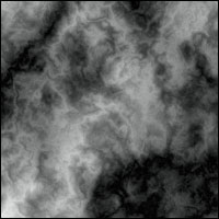
Now all you have to do is press the OK button to render the effect, and there you have it - an extremely detailed rock texture you will find useful for all sorts of things.

NB. If the effect is still a bit too dark for you, use the Image > Adjust > Brightness/Contrast tools to increase the brightness and contrast to your own personal tastes.


Variations: The random nature of the cloud plug-ins means you'll get a different result each time you run them.   You should, of course, feel free to experiment with the concepts used throughout the tutorial.  The texture on the left, for example, has a little grain added with the optional part in step 1.  Likewise, adding more noise to the 2nd step will also yield more rugged results. The key to artistic success is experimentation.  Remember that, and you'll be laughing.


Saturday, February 5

create-an-rough-woody-text-effec

 
Ok let’s get started!
To complete this tutorial, you need to the following stocks:


Step 1

Create a new document sized 700px * 1000px with white background, then paint some dirt texture with the brush you downloaded: (please use any brush you like, no need to use the same brush as mine)


 Grab a chalk brush from the brush window and set the brush colour to be light brown, then paint some ground on the canvas:


Step 2

Load the nature path stock image into Photoshop, select a portion of the image as shown below:


Copy and paste the selection onto our image, then adjust the perspective a bit with the free transform tool:

I decided to add some art feeling to the image. Go to Filter > Artistic > Cutout and  apply the following settings to this ground texture:


Then erase the edge of this ground texture with a soft eraser:


Step 3

Use the font we download, type a letter on the canvas:


Apply the follow layer blending options to this text layer:
Bevel and Emboss


Gradient Overlay

 Select the chalk brush preset from the brush window:


 Use the eraser tool with the chalk brush setting, erase the edge of the text to create some roughness:


Step 4

Load the wood splinter image into Photoshop, use the Quick Selection tool to select a sharp piece from the image:
Copy and paste the selection on to our letter:

 
Go back to the wood stock image and repeat the step above, until the entire letter is covered.
Use the Warp Tool to adjust the shape of the wood for the right part of the letter:


Use a soft brush to erase the edges so it blends into the background:


Carefully paint shadow under the text with a soft black brush, use the Free Transform tool to adjust its size when necessary

Step 5

I decided to use my own colour for this image. So I add a black and white image adjustment layer to the top of all previous layers:


By have this black and white adjustment layer, we can re-define the colour of the image, and also make certain areas darker (or lighter).
Also add a Curves adjustment layer on top of the black and white adjustment layer:


Mask on this Curves adjustment layer:


Use the dirt brush you downloaded, paint some splash around the edge of the text:


Create a new layer and use a dark green (or yellow) brush with around 20% flow and opacity, paint over the areas indicated below: (This adds a level of roughness and give the image some rusty feeling)


Step 6

We’re almost done. I decided to add some more rough feeling to the image. To do this, flatten the image (make sure you save a layered copy before you do this) and duplicate the background layer, apply the following Reduce Noise filter to the duplicated layer:


Reduce the layer opacity of this duplicated layer to around 80%, then add the following image adjustment layers on top of it:
Levels


Mask on Levels adjustment layer


Curves
Colour Balance

Mask on Colour Balance layer:

 For more depth of the image, use the dodge and burn tool (with around 20% exposure) as indicated below:


and here is the final effect: (click to enlarge)


link here