Tuesday, April 28

Draw A Smiling Monkey

Draw A Smiling Monkey


At first click on Pen Tools and make a monkey head. Click on the below image to enlarge the below example and give this color to monkey head : #6E4A25.


■1.☺ Now make a left Ear for the monkey, Click on the pen tools and make a Ear like the below example and then give this color to the Ear : #C08E5B


■2.☺ And then add stroke to the monkey Ear, Go to Layer > Layer Style and select Stroke and then change the size from 3px to 1px and then click on Ok.


3.☺ Now make the right Ear and give the same color.


4.☺ And then add stroke to the monkey Ear, Go to Layer > Layer Style and select Stroke and then change the size from 3px to 1px and then click on Ok, Then you will see some thing like this :


5.☺ Now add a Black Stroke with 1 px to the mouth area of the monkey.


6.☺ Now make up the Eye Area for the monkey, Click on the Pen Tools and make up a Eye area for the monkey ( Click on the below image to Enlarge ) See the below example :


7.☺ Now make another left Eye Area for monkey and a Stroke with 1px to the both Eye Area. ( See the below example ):


8.☺ Now make up nose for the monkey to Smell, Click on the Pen Tools to make a nose for smelling. ( Click on the below image to Enlarge ) See the below example :


9.☺ Add a Stroke with 1px to monkey nose and then add a white shape over on the nose see the below example.


10.☺ Lets make up mouth ( tooths ) to eat, Click on Pen Tools to make Tooths for the monkey. ( Click on the below image to Enlarge ) See the below example :


11.☺ Add a a Stroke with 1px to the Tooths, See the below example.


12.☺ Now divide the Teeths in Sixth parts,
See the below example : ( Using brush tools with in the size of 1px. ) .


13.☺ Now divide the Teeths in the middle, See the below example : ( Using brush tools with in the size of 1px. )


14.☺ Click on brush tools (1px) and draw some lines the in the Ear’s and over Mouth and that’s it you are finised ( ENJOY ).


[Valid Atom 1.0]

Create Your Own Letterpress

Create Your Own Letterpress/Inset/Debossed Text

The effect itself can be easily replicated using the layer styles built right in to Photoshop, follow these simple steps to create your own letterpress style text effect.


1. Type out your desired text into your Photoshop document,
maybe this could be part of your website header or a button graphic.


2.Double click on the text layer to open the layer styles properties.
First, add a gradient overlay to the text. Choose two swatches at a slightly darker shade to the background colour and position the angle straight downwards.


3. Next, add an Inner Shadow to simulate how the light would form a cast of shade on an inset shape. Alter the distance according to how deep you would like to effect to be, using very subtle amounts usually gives the best results. Drop the opacity to around 30%.


4. Finally, add a Drop Shadow to the text. By default the Drop Shadow produces a dark, blurred shading effect, swap around the options such as the Blend Mode, Color, Distance and Size to create a very fine highlight along the bottom edges of the letter


5. The final image shows how these simple techniques can give the impression of a realistic effect. The subtle gradients, fine shadows and highlights help represent how the effect would appear in reality.


6. Rather than using a shade of the background colour on the Gradient Overlay, try a very dark grey/black to give a cool Adobe CS4 style effect to your text!

Accent A Logo With Colored Lines


Accent a Logo with Colored Lines

This tutorial will demonstrate how to make some eye-catching colored lines to accent your logo.

Step 1:
The Logo

These lines we’re going to create always work better if you have a black/dark background behind your logo. I created a black and white logo for the sake of this tutorial.


Step 2:
Draw It Out

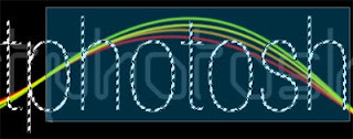
Using the Pen Tool, draw yourself a curving line around your logo. You’re not going to close this shape, though you could if that’s the effect you want (one continuous line). If your shape has been filled in, go over to your Layers window and change the Fill to 0%.


When you’ve drawn the line you want to use, add a New Layer to your project, either above or below your logo, depending on how you want it to appear (mine is on a layer above my logo). Be you have selected the layer you drew your line on.

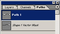
Go to your Paths window (usually located in the same window as your Layers), and double click on the little path that shows up. Name it whatever you want.


Return to your Layers window. Select that new layer you made a bit ago. Select your Brush Tool. Change the style of the brush, color, and anything else you’d like to change about it. I used a diagonal slant brush so the thickness varies slightly as it traces the line.

Return to the Paths window. Right-click on the path layer you see there (named whatever you called it), and select Stroke Path. When you select this option, it will ask you what you want to use to stroke the path. Choose the Brush Tool you just modified. Now you have a line!


Step 3:
The More (Lines) the Merrier?

You don’t want to add too many lines to your logo. If you do, it’s going to a couple negative things for you. It is going to distract you completely from your logo, and it’s going to be so busy it’s not going to look appealing at all. Remember that sometimes less is more.

Okay, so we can do this a couple different ways. You can either keep modifying the original line you created, or you can duplicate the line, modify it, use it, then duplicate that one and modify it and use it. It’s really up to you on this one. I would recommend duplicating the path layers so you have different ones to choose from, and if you mess something up while you’re playing around, you don’t have to go back and recreate the line again. Layer duplication is like backing up your hard drive. You never know what is going to go wrong or when, so it’s always good to have a spare in reserve.

Duplicate the path layer and call it whatever you want.
- Be sure to add a new Layer in your Layers window, above (or below) that first line’s layer (I did mine above).
- After selecting the new path layer you created, select the Rectangular Marquee Tool (dotted selection box).
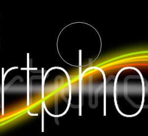
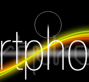
- Hold down CTRL and click on the line you drew in your project.
When you click on it, it will bring up some anchor points you drew in earlier when forming the line, as well as some handles to change the shape.
- Modify them as you like.
- I moved them in a couple different directions, so the lines will almost have a twisting ribbon effect when you’re finished.
- Change the color of your Brush Tool, right-click on your path you’d like to make into a line, and select Stroke Path, and use your Brush Tool. **Be sure you have a new Layer selected in your Layers Window before you add a Stroke to another path.


Do this as many times as you need to for as many lines as you would like.

Step 4:
Winding Lines With The Logo

I don’t want all of my colored lines to pass in front of my logo, only some of them. To remedy this, go to your Layers window. Hold CTRL and click on your logo/text layer, selecting anything visible on that layer. Select each one of your colored line layers individually and use your Eraser or white Brush Tool to erase the colored lines that you do not want to overlap your logo (i.e. anywhere the text is in front of the colored lines, erase there).


Step 5:
Shine It Up!

The lines still look a little bland. They’re nice and all, but they need something else. Double click on each one of the layers and add an Outer Glow, in the same color that the line is. Opacity 50%, Spread 3 and Size 18 (or variations on these).


Add a new Layer under your logo’s text. Using the Polygonal Lasso Tool with about 3px Feather, draw a really wide and short diamond. Fill it with white.


Adjust the Layer Opacity to about 40%. This will make it appear as though it’s glowing/shining a little across the middle.

Step 6:
Quick Tip Text Trick

Duplicate your text layer with your logo text on it. Right click on the layer and Rasterize it. Select your Smudge Tool (with the Sharpen/Blur Tools). Change the brush to Hard Round, and adjust the Strength to 30%. Go to the top of a letter, like an “h” or a “k” or something, click the mouse and hold, press and hold shift, and move your mouse up away from the letter so it spreads/smudges the edge, then release everything. Adjust the size of the brush appropriately. Repeat this as many times as you’d like to obtain the desired effect. Doing this to some of the letters makes the logo a little more cutting edge
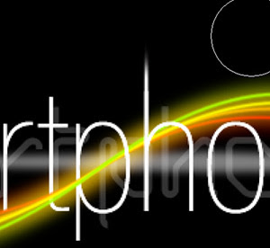


DONE !!


Looks cool ,
Hope you enjoyed this tutorial and create your own style !

SKETCH PHOTO EFFECT

Using this thoroughly explained, detailed photoshop lesson, you will see how to create sketch photo effect.

Step 1

First, find any photo which you like to use for this lesson and open it in Photoshop.


Step 2

Duplicate now your layer (CTRL + J) and choose Filter > Stylize > Glowing Edges. After that, make the adjustments as follow:


Step 3

Set the blending mode to Soft Light and after that choose Layer > Merge Down.


Step 4

Choose now Image > Adjustments > Auto Color and duplicate layer once again.

Step 5

Choose now Filter > Blur > Motion Blur and make the adjustments as follow:


Step 6

Go now to Image > Adjustments > Levels and make the adjustments as follow:


Step 7

Set now the blending mode to Vivid Light.


You should now have something like below.


Congrats !!

LINK

Monday, April 20

Changing Focus


Make Parts of an Image Stand Out by Changing Focus
---------------------------------------------------------------------
Subscribe

In this tutorial I will show you an easy way to take an image and make parts of it out of focus to bring the attention on another object in the image.


I just found a random picture to show you this simple method.

So after you open the image grab your pen tool


Make sure your settings on your top bar when you have the pen tool selected are set like this


Now with the pen tool I want to make a selection around the object we want to let stay in focus.


So zoom in on your image with ctrl+ and - to zoom out and start clicking with your pen tool to make a selection

Start clicking here


The straight lines in the image are the easy part with the pen tool but once you get up to the rounded area it takes a little patience


Once you make it all the way around the part in the image connect the pen tool to where you started then right click in the middle of where you went around the object with the pen tool and click “make selection”


Next we want to use a little keyboard shortcut to invert the selection so it selects everything else in the image and not our part we want to focus on. The shortcut on a windows keyboard is ctrl+shit+i, which inverts the selection.

So use that shorcut and it should select the other part of the image

Here is the first selection


After you use the keyboard shortcut you will see an outline around the edges of the image


Now cut and paste that part of the image back in the document by using ctrl+x then ctrl+v to paste it back in.

Once you paste it back in hold down ctrl and click on the little image icon of the new layer we made and it will highlight around the object again
.


Now the trick is just to add a little lens blur to what we cut out.

So go to filter ->> blur ->> lens blur


Make sure you keep the selection around the object so the blur doesn’t go outside of the selected area.

Use these settings


Here is the before picture and the after picture