Design an Elegant Abstract Site Header Image in Photoshop
In this tutorial, I will show you the processes I used to design this really cool, abstract style site header image in Photoshop, similar to the one I currently have on psdvault.com.
Personally I can see an increasing trend of having a big and eye-catching header image for website/blogs, especially since broadband has become a commodity amongst the majority of the population.
Along the way, we will practice the use of Pen Tool, various image adjustment options, free transformation tool, layer blending styles and filter effects. Hope you enjoy it!
Step 1
Create a document sized 1200 x 600 px (Please note that you may specify any size that you think suitable for your site design, this size can only be used for practice purpose only). Fill the background layer with Black.
Create a new layer called “Radial Gradient Fill” and grab the Gradient Tool (G), select theRadial Fill option and fill the newly created layer as shown below: (you can specifiy any colour you like)
Then Create a new layer call “Angle Gradient Fill” on top of the “Radial Gradient Fill” layer, set its blending option to “overlay”
use the Rectangular Marquee Tool to select the centre portion of the layer, again use the Gradient Tool (Set the foreground colour to white, with transparent background), this time we select the Angle Gradient option, fill the selection as shown below:
Step 2
Duplicate the “Angle Gradient Fill” layer once and keep the blending option of the duplicated layer as “overlay”, go to Edit > Transform > Flip Horizontal and flip the layer horizontally. Merge the twol layer together. Keep the blending mode as “overlay” after the merge.
Apply the “Drop Shadow” blending option to the merge layer as shown below:
Then reduce the previous “Radial Gradient Fill” layer opacity to 60% and you will have the following effect:
Then create a new layer in between the previous two layers, name it as “centre light”. Grab a big soft round brush (600px in my case), set the foreground colour to white, and paint a single dot in the centre of the layer:
Set the layer blending mode to “overlay” and you will have the following effect:
Step 3
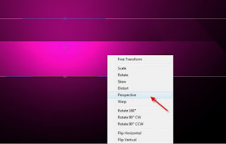
I decided to give this image a bit more depth and a bit 3D feeling. So on the “Angle gradient fill” layer, hit Ctrl + T and bring up the free transformation tool, choose the “perspective” option and transform this layer as shown below: (reduce the top width)
Here is the result after perspective the layer:
Step 4
Create a new layer called “shineline”, use the Pen Tool to create the a work path as shown below: (For those who are yet to be familiar with pen tool, I have a post here with some useful links to pen tool tutorials)
Then right-click and choose “stroke path” and select “brush” (make sure you select a small soft round brush). Make sure you have “simulate pressure” option enabled as well.
Here is effect so far:
Step 5
Duplicate the “Shineline” layer a few times, use the Free Transformation Tool to rotate, distort, resize the duplicated layer and mixing those lines together:
Merge those dupcliated layers together and duplicate the merged layer a few more times, again use the free transformation tool to add a few more lines on the image:
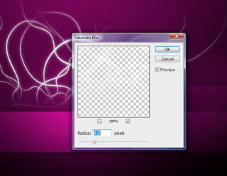
Duplicate the merged layer, apply Gaussian Blur with the following setting on the duplicated layer
You should have the following effect so far:
Step 6
Create a new layer called “shining dots”, load the selection of the “shineline” layer, then right-click and select “Make Work Path”:
Select 0.5 pixel tolerance for the work path. Now let’s grab a 3px soft round brush with the following dynamic brush settings:

Also make sure you tick the “Smoothing” option.
On the “shining dots” layer, stroke the path with this brush and you will see the following effect:
Step 7
Now we can add a bit of cloud/smoke at the bottom of those lines. To do this, we simply create a new layer and use the Lasso Tool with 40px feather to select the bottom portion of those shining lines, and go to Filter > Render > Cloud and render some cloud: (set foreground colour as white, background layer as black)
You may notice I also use the Len Flare with following settings to highlight the centre portion of the cloud:
Change the layer blending option to “overlay” and you will have the following effect:
Lastly we place the site name and the navigation on the image:
Ok that’s it for this tutorial! Of course you can further enhance it by adding some other filter effects, change the colour scheme, etc.
Here are the final image for this tutorial:

Alternative versions:


Hope you enjoy this tutorial, drop me a comment if you have any question, I will try my best to help you out.
Cheers and have a nice day!


