
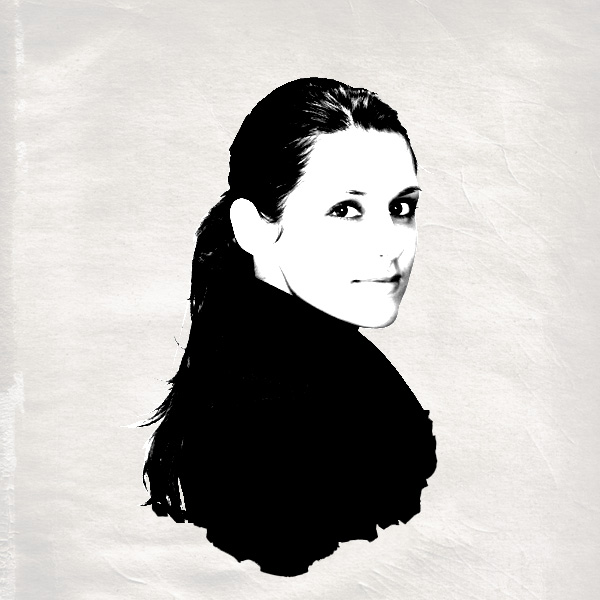
Final Image
This is the final that we’ll be creating:
Images Used
These are the photos that I’ve used for this tutorial.http://www.sxc.hu/photo/1107722
http://www.sxc.hu/photo/1124484
Burnt Paper
http://www.sxc.hu/photo/501004
http://www.sxc.hu/photo/106059
http://www.sxc.hu/photo/1133977
http://www.sxc.hu/photo/731511
Step 1
Create a new document (600X600px) and paste in an image of an old paper texture. Call this layer ‘paper texture’.
Step 2
Now go to image>adjustments>hue/saturation and reduce the saturation to -60, and increase the lightness to +80. This should give you a nice looking washed out background.
Step 3
Now paste in a portrait photo of a woman into the center of your canvas.Be sure to cut out the woman from her original background using the lasso or pen tool selection tools. Name this layer ‘woman photo’.

Step 4
Now go to image>adjustments>desaturate, to grayscale your photo. Then go to image>adjustments>brightness/contrast and increase the contrast to +85.
Step 5
Next I paste in an image of some burnt paper. Resize the paper so that the edge of the burn fits with the edge of your woman’s torso. I reduced my layer opacity on the burn layer in order to judge where these edges were.
Step 6
Now use your magic wand tool at 50 tolerance and click on the white part of your burnt paper image.Then go to select>inverse. This should select the dark part of the burn. Then create a new layer called ‘burnt paper outline’ and fill this selection with black.
You can see the resulting shape below. After this is done use your lasso tool to cut away and fill in parts of the woman’s torso to fit with this burnt paper edge.

Step 7
Now select the dark parts of your image (the shadows of your woman and the black burnt paper outline).To do this go to select>color range. Then select ’shadows’ from the drop down list, and set selection mode to ’selection’. Finally increase ‘fuzziness’ to 200. Hit OK, and this should select the dark parts of your image (which are shown up as white in the preview box).

Step 8
Now with your selection in place go to select>save selection and save it as ‘mask selection woman’. Create a new top layer called ‘gradient overlay’. Then deselect. Now select a large paintbrush (100px), and set hardness to 0%. Then choose a nice bright/obvious color (I went with red) and paint over your woman’s facial features and parts of her hair.
Step 9
Now we want to apply a layer mask in order to fit the red paintbrush marks over the dark parts of the woman’s face/hair. To do this go to select>load and load your previous selection (‘mask selection woman’). Then with your selection in place go to layer>add layer mask>reveal selection.You can see the result of this below:

Step 10
Now right click on your paintbrush layer and go to ‘blending options’.Apply a gradient overlay, with using the settings shown below. This should turn your red overlay into a nice gradient transition, giving a spot of color to your woman’s face.

Step 11
Now reduce the opacity of your paintbrush layer to 70% to make the coloring more subtle.
Step 12
Now paste in a photo of a newspaper headline over the woman’s body. Use the same technique of loading the selection and applying a layer mask to fit the photo properly to your woman’s shape.

Step 13
Now change the layer’s blend mode to ‘hard light’ and reduce it’s opacity to 90%. Also use a large, soft eraser brush to erase away the edge of the newspaper, as the photo cut off the top unnaturally. Erasing the top edge subtly should also give the newspaper image some depth.
Step 14
Now repeat these steps and add more photos over the woman’s body/hair. For the other photos keep the layer’s blending mode’s at ‘normal’, as you only want the bold newspaper headline to be a really harsh light.To blend the images nicely together do 3 things:
Reduce their layer opacities to around 40%
Erase their edges using a large, soft eraser brush
Desaturate them.

Step 15
Now I want to improve the gradient color overlay over the woman’s face/hair. I change the light green part of the gradient to a reasonably dark blue, and then use my paintbrush to paint in a little more over the edges of the woman’s hair, so as to extend my gradient overlay effect.
Step 16
Now merge your burn paper edge with your woman photo layer. Reduce the merged layer’s opacity to 87%. This should make your image look overall more subtle.
Step 17
Now create a new layer above your newspaper image layer and use a large, soft black paintbrush (30% opacity) and paint in a subtle shadow, making the newspaper get darker near it’s bottom. Then apply the selection/masking techniques shown earlier to fit the shadow to the woman’s body.
Step 18
To finish off I add some nice details, including the Swirl 2 Brush from QBrushes and a handwritten style heading using the free font Dirty and Classic
And We’re Done!
Obviously much more can be done with these techniques and you can come up with some really complicated compositions. However, hopefully this tutorial taught you some cool techniques for you use in your own designs!LINK HERE
thank you!~
ReplyDeletevery nice tutorial for adobe photoshop. i had learn this course but until now im not mastering on it. i think i could start learning from your site. :)